positive and negative space drawing tree
In this post, I will discuss what positive and negative space is and how you can use it to improve your paintings.
- What Is Positive and Negative Space?
- Positive And Negative Space Illusion
- Positive And Negative Space As A Composition Tool
- Interlinking Positive And Negative Space
- Positive Space Is Not Always More Important Than Negative Space
- Thanks for Reading!
What Is Positive and Negative Space?
Positive space refers to areas where the subject is positioned. Negative space is the area surrounding the subject. Or in other words, positive space is the main focus area whilst negative space is the background.
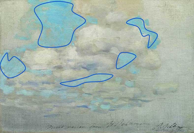
For example, if you take a cloudscape, the clouds are the positive space and the blue sky is the negative space.

I have outlined the negative space below. Notice how the negative space forms these unique shapes. This is an important part of the overall composition. The area which is not outlined is the positive space.

However, this is assuming that the clouds are the main focus. Some of the time it is not clear what the main focus of the painting is.
Positive and negative space is inherently subjective. Some people may see one area as being a positive space, but others may see that same area as the negative space. This is because the way we all perceive the world varies from person to person. What I see may be completely different from what you see.
Positive And Negative Space Illusion
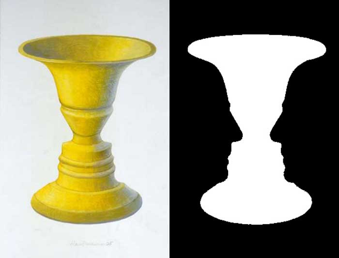
Several positive and negative space illusions have been developed to illustrate that our perception varies from person to person. Below is one of the most famous positive and negative space illusions:

Take right half of the above image and think about if you see:
a) A vase; or
b) Two faces.
My initial observation was a vase. To see the vase, my mind must assume the black area is the negative space and the white area is the positive space.
If you see the two faces, then you are assuming the white area is the negative space and the black area is the positive space.
On the left side, the vase is much more apparent due to the added detailing. You can still see the two faces, but you may need to change your focus.
The point is, positive and negative space is to some extent subjective. However, this illusion is an extreme demonstration of the differences in perception. Most of the time, the positive and negative space will be obvious and everyone will see the same thing.
For example, in the cloudscape painting earlier in this post, I think it is safe to assume almost everyone will see the clouds as the positive space.
Positive and negative space can form an important part of your overall composition. You can use positive and negative space to create a sense of balance andrhythm.
Balance
Balance is one of the basic principles of design and refers to how well all the elements are balanced with each other. There are no hard and fast rules to determine if a painting is balanced or not. It is usually just based on your own observation.
In terms of positive and negative space, a small area of busy, positive space (when I say busy I mean a lot is going on) can be just as powerful as a large area of quiet negative space.
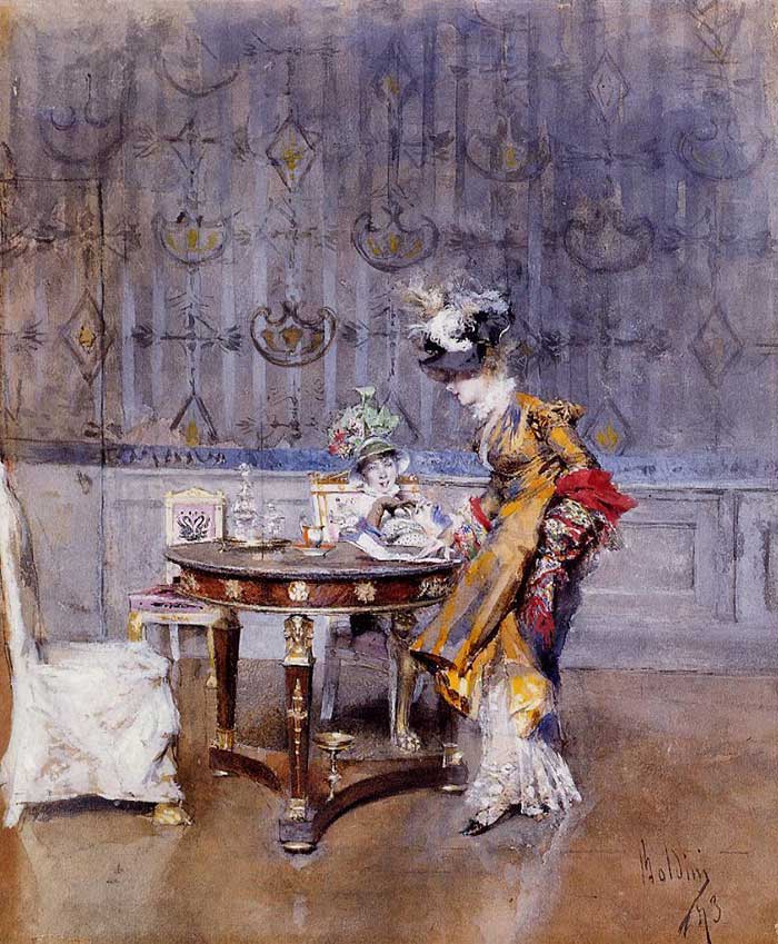
In the painting below, the positive space would be the subjects in the center at the table. The negative space is the floor and wall. Notice how much area the positive space is taking up compared to the negative space. But it appears balanced, to me anyway. This is because the positive space is busy. There is more saturation in the colors, more contrast and more detail. The negative space on the other hand, is comparatively smooth, dull and less detailed.

Rhythm
Rhythm refers to the underlying "beat" of your painting, much like in music. Rhythm can be created through repetition, alternation and pattern.
You can use positive and negative space to create a sense of rhythm by:
- Using repetition and patterns in the shapes and intervals created by the positive and negative space.
- Alternating between positive and negative space in a rhythmic manner.
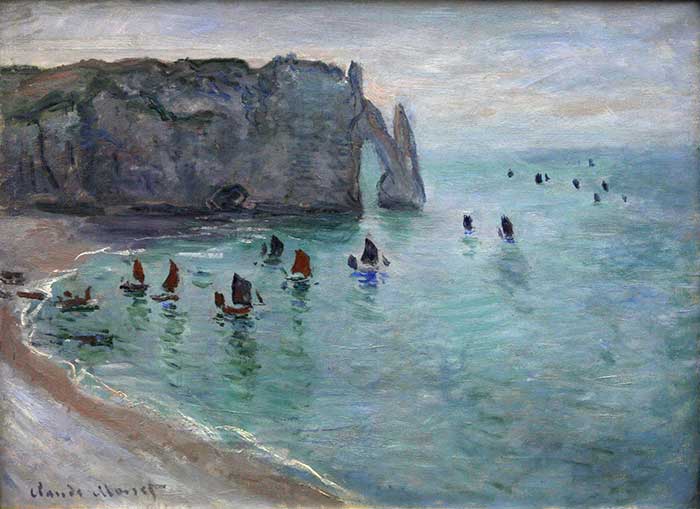
In the painting below by Claude Monet, notice the rhythm created by the alternating positive (boats and the cliffs) and negative space.

To be honest, I do not actively think about rhythm whilst I am painting. But it is always in the back of my head.
Interlinking Positive And Negative Space
An interesting technique that you can use to strengthen the design of your painting is to interlink the positive and negative space by using areas of matching value, hue or other elements.
For example, take a look at the painting below. The positive space is the subject in the center. The rest of the painting is the negative space. Childe Hassam interlinked the positive and negative space through the use of similar values and hues. The orange of the hair and the skin tones are a similar hue to the background. The hand is a similar value to the background.

Positive Space Is Not Always More Important Than Negative Space
Many people would assume that positive space is more important than negative space as it is the area that is in focus. But I think that is a flawed way of thinking about positive and negative space.
Positive and negative spaces exist together. There will pretty much always be areas in focus and areas which are not in focus. You should think about positive and negative spaces as a team rather than opposing forces.
In the painting below, I do not consider the negative space any less beautiful than the positive space (which I perceive to be the bridge, land and sun). The vast area of vibrating hues in the negative space is just as interesting as the small areas of positive space with high contrast. It is all nicely balanced.

Negative space does not need to be bland. It should by nature take the backseat, but you can use more subtle approaches to create a variance in the negative space such as subtle changes in hue within a narrow value range.

Anyway, I will leave you with some more beautiful paintings below. Observe the paintings and consider:
- Is positive and negative space a feature of the painting?
- Is the positive and negative space balanced?
- Is there any rhythm created by the positive and negative space?
- Are there any interlinks between the positive and negative space?


Thanks for Reading!
Thanks for taking the time to read this post. I appreciate it! Feel free to share with friends. If you want more painting tips, check out my Painting Academy course.
Happy painting!

Dan Scott
Draw Paint Academy
Source: https://drawpaintacademy.com/positive-and-negative-space/
0 Response to "positive and negative space drawing tree"
Post a Comment